A governed supply-chain command centre — twelve decision workspaces over a single semantic model. Built once as a React front end, then served by two interchangeable back ends: a Cloudflare edge stack and a self-hosted ASP.NET Core + PostgreSQL port, tuned to return byte-identical analytics.
Decision workspaces across three groups
Governed metrics in one semantic registry
Analytics parity between the two editions
WCAG 2 A/AA violations (axe audit)
One governed model, many decisions
Supply-chain teams don't lack dashboards — they lack a single version of the truth. Nexora answers one question per role: where is service, cost, or working capital slipping, and what do I do about it? Every figure on every screen resolves back to one semantic metric registry, so “fill rate” means the same thing in the executive board, the fulfilment workspace, and the AI copilot.
Parity by construction: the same metric, the same math, two runtimes. Ratios returnnull, neverNaN— a missing prior period shows an em-dash, not a broken number.
The flagship is the Executive Command Center: a twelve-tile KPI board (two rows of six) with direction-aware variance, targets, and sparklines, backed by revenue, service-and-margin, inventory, and order-flow charts and a financially-ranked risk queue.
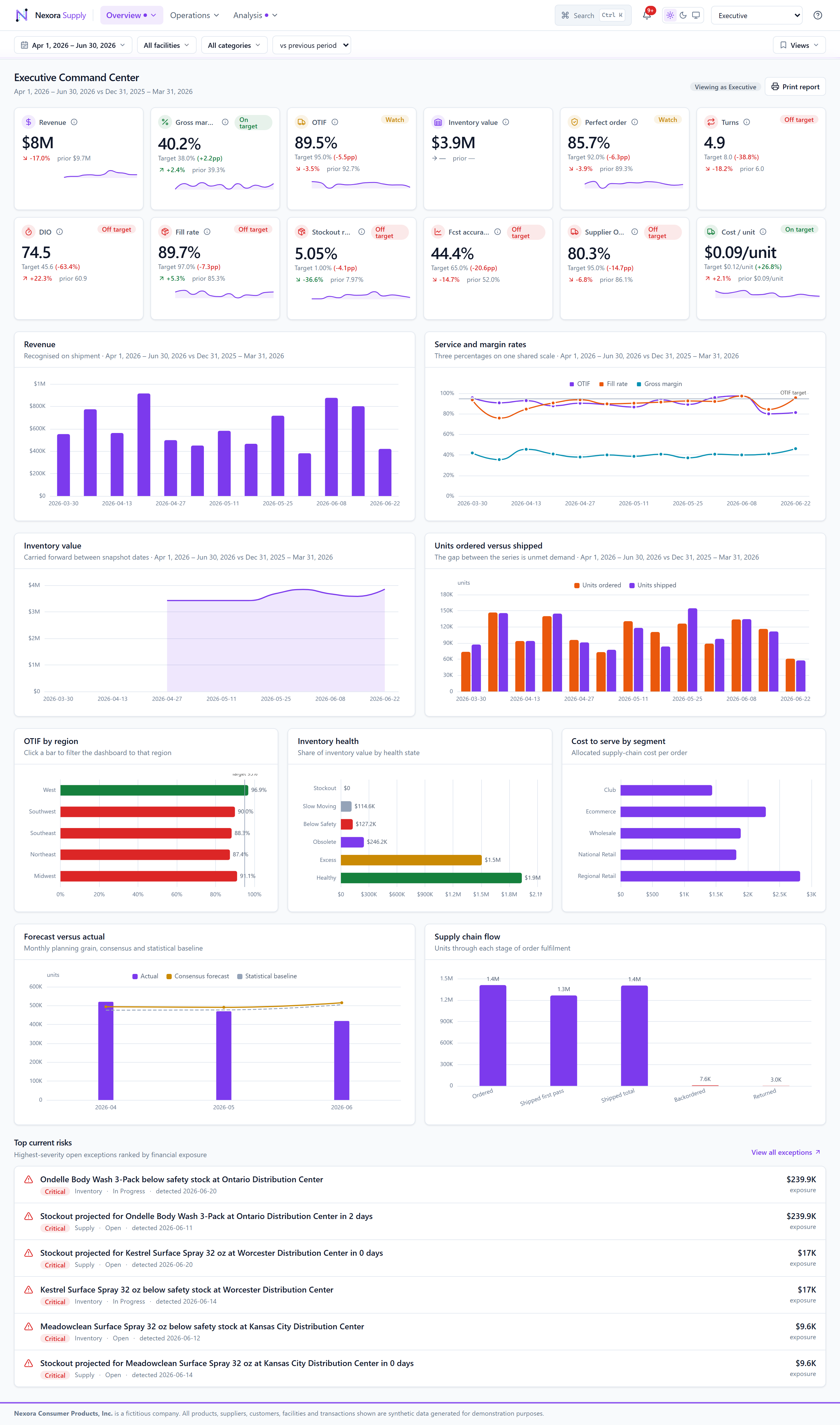
Executive Command Center. Twelve KPIs in two even rows of six, global filter bar, cross-filtering charts, and a top-risk queue ranked by financial exposure.
Twelve workspaces, three decision groups
Navigation is grouped into Overview, Operations and Analysis. Every workspace shares the same filter bar, saved views, light/dark theming, and drill-through.
Overview
Command Center
Executive overview of service, cost and working capital — the 2×6 KPI board.
Risk & Exceptions
A prioritised exception queue spanning every risk category, ranked by exposure.
Command Center — KPI board & charts
 Risk & Exceptions — prioritised queue
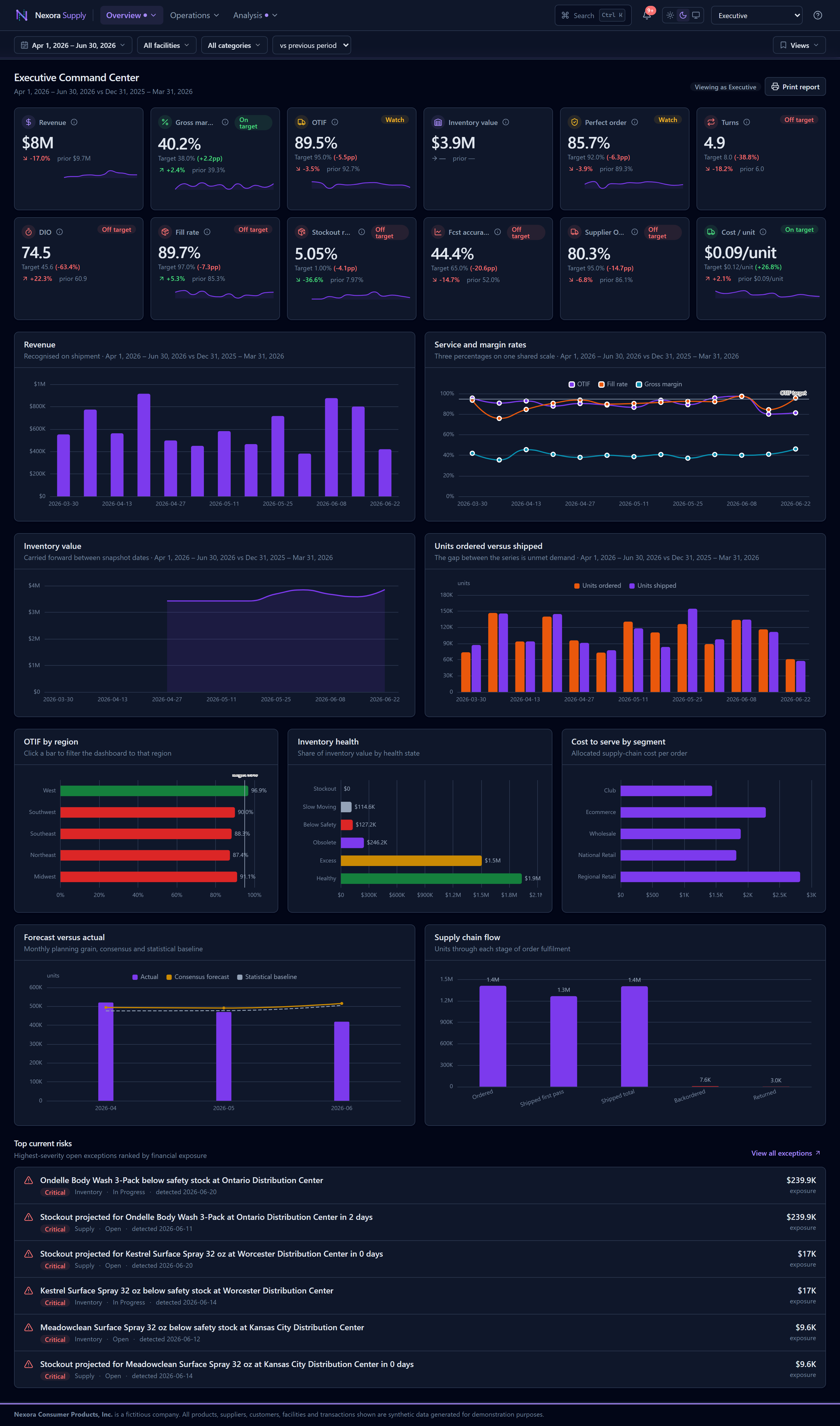 Command Center — dark theme
Operations
Inventory
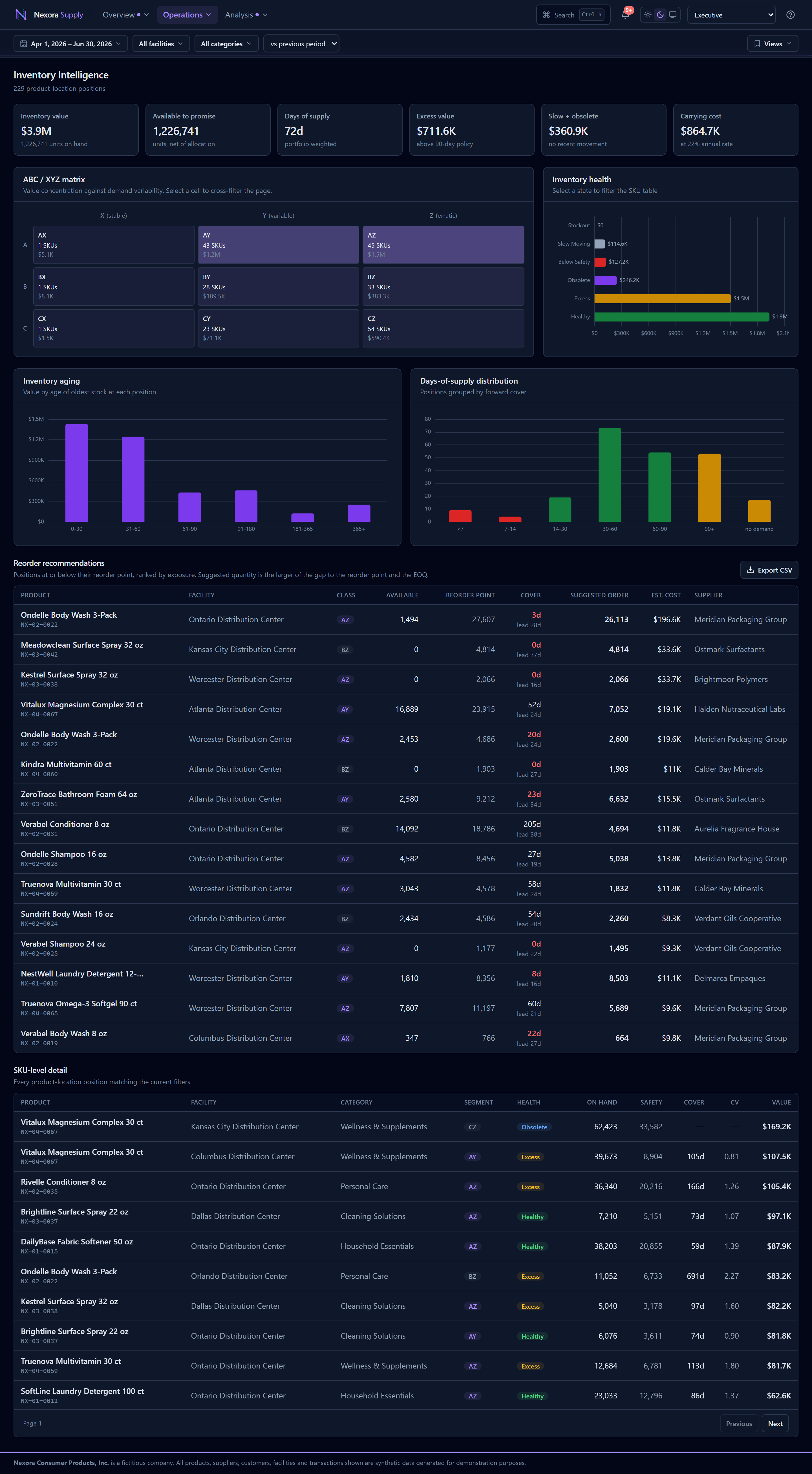
ABC/XYZ segmentation, health, aging and reorder recommendations over a virtualised SKU table.
Demand & Forecast
Forecast accuracy, bias (WAPE) and a twelve-period outlook with consensus vs baseline.
Procurement
Supplier scorecards across spend, lead time, on-time delivery and quality.
Order Fulfillment
OTIF, fill rate, backorders and cost to serve by channel and segment.
Transportation
Carrier and lane performance, freight cost and emissions.
Network
Plant and distribution-centre capacity, throughput and utilisation.
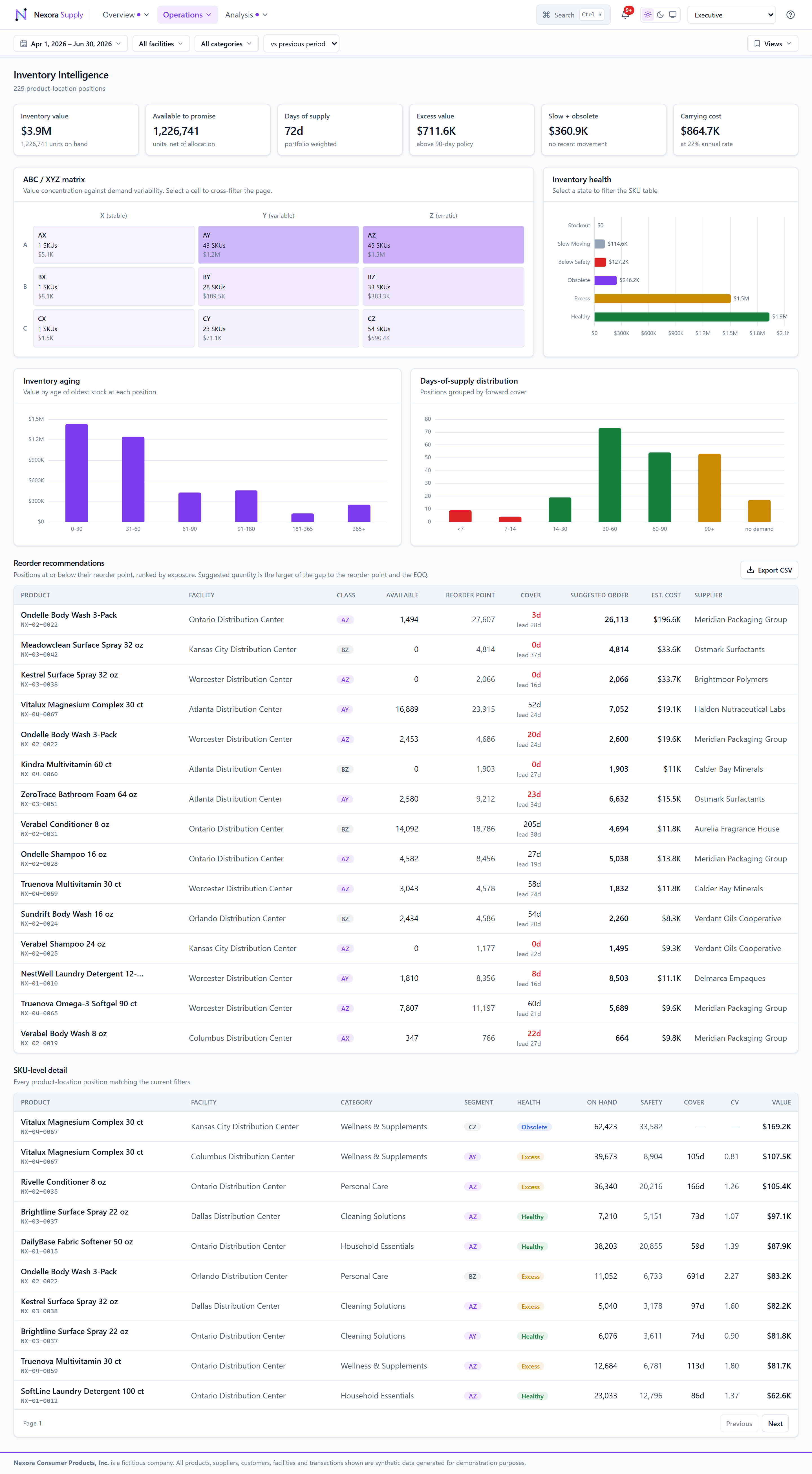 Inventory — segmentation & virtualised table
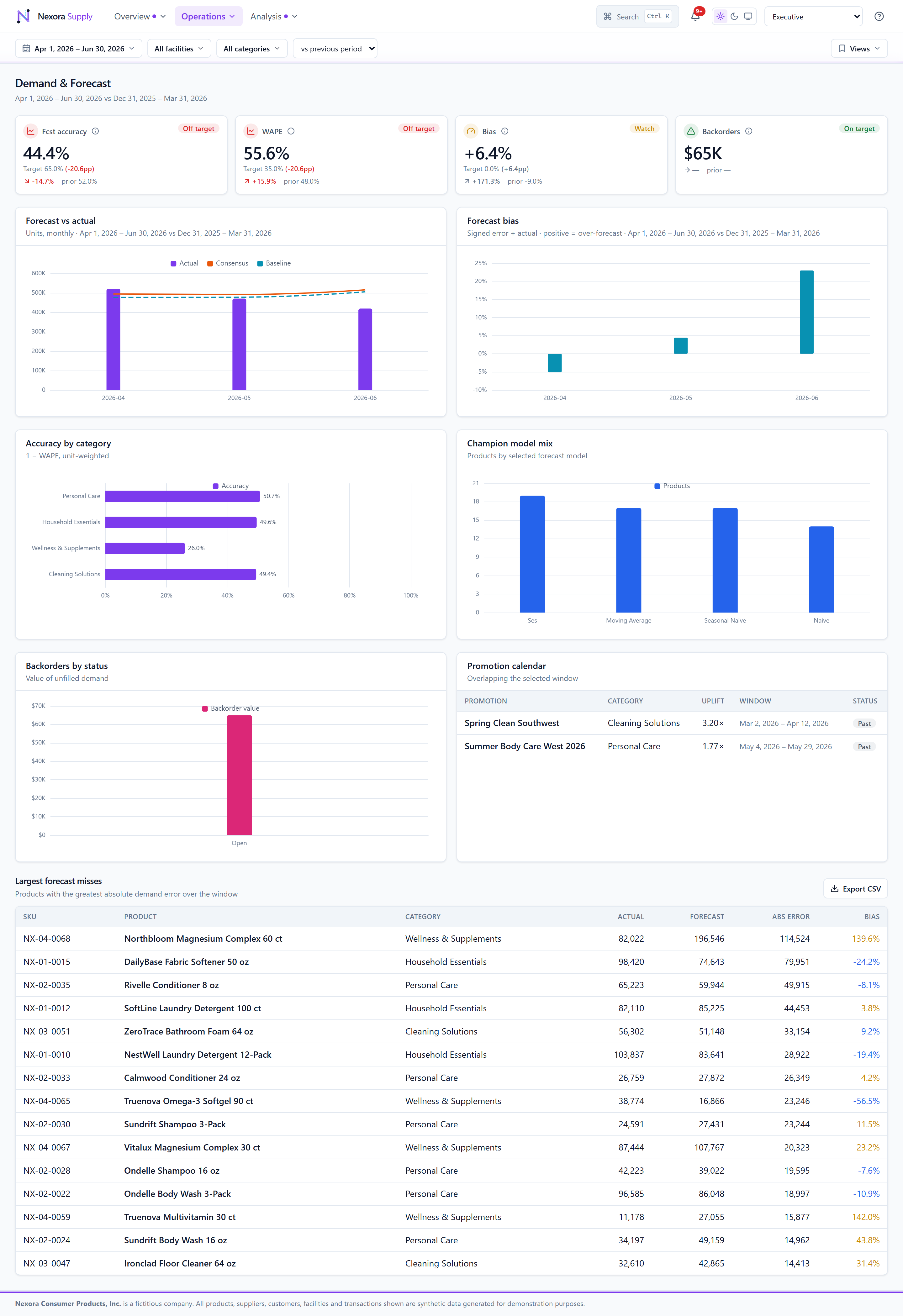 Demand & Forecast — accuracy & outlook
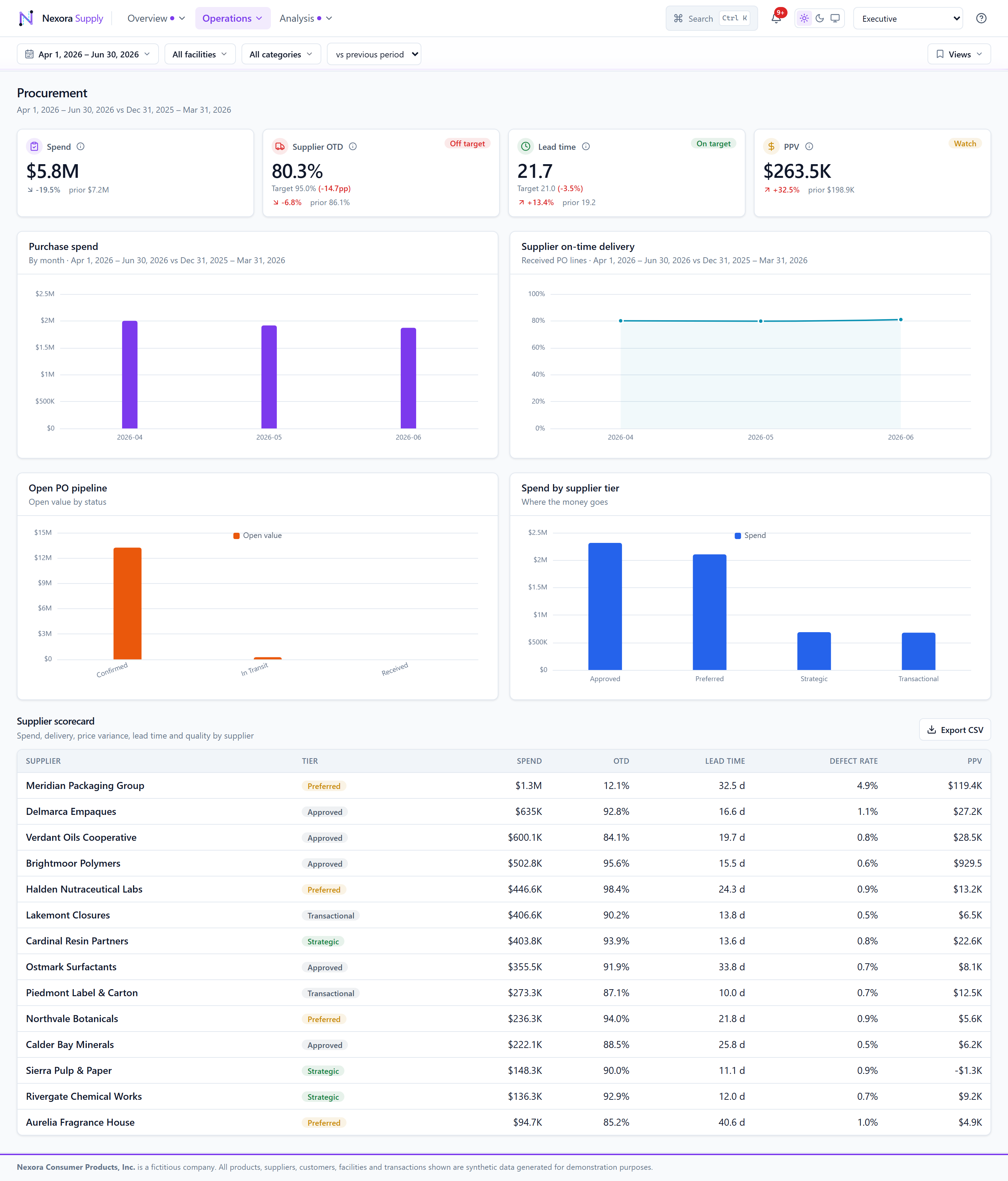 Procurement — supplier scorecards
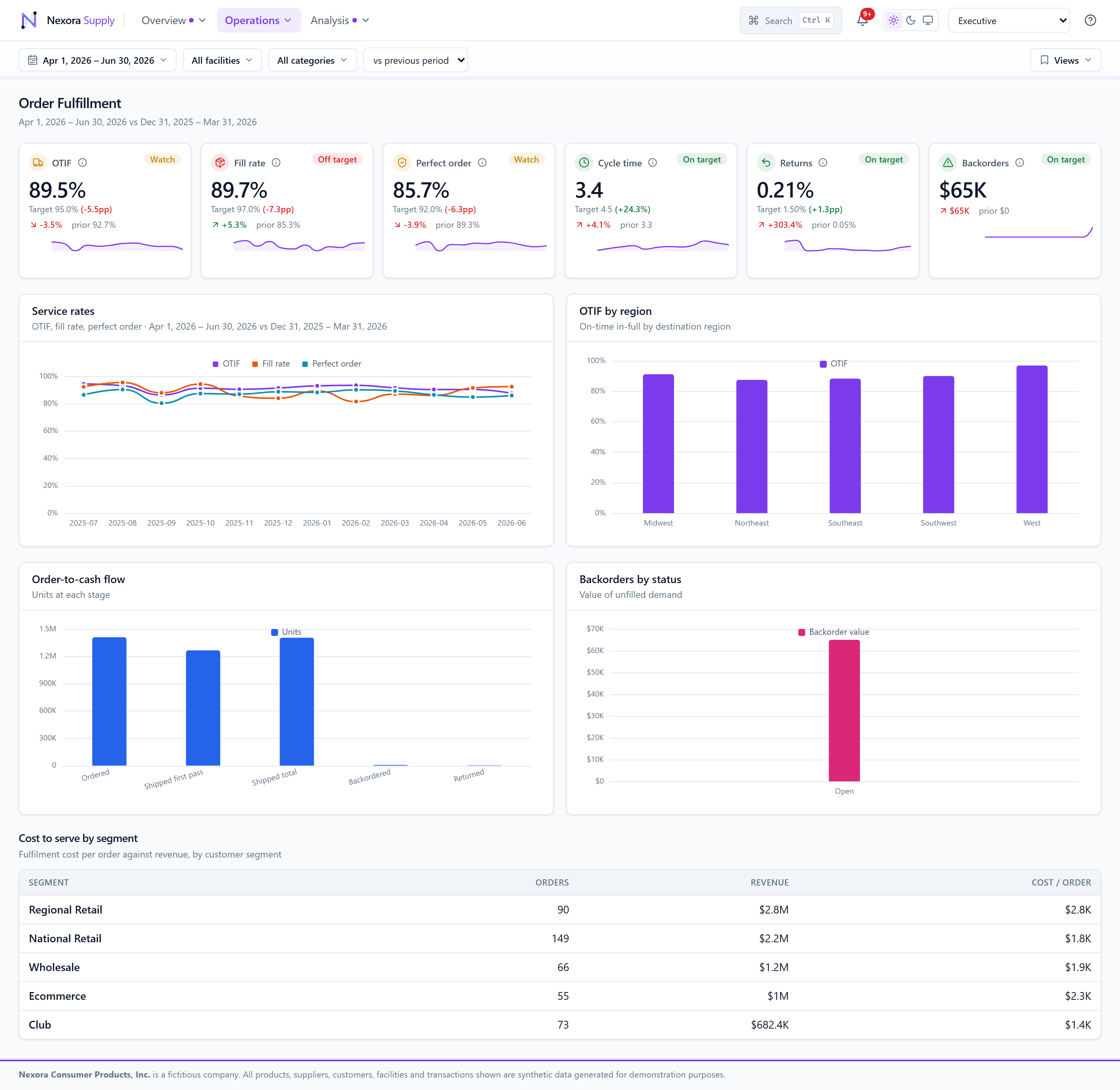 Order Fulfillment — OTIF & fill rate
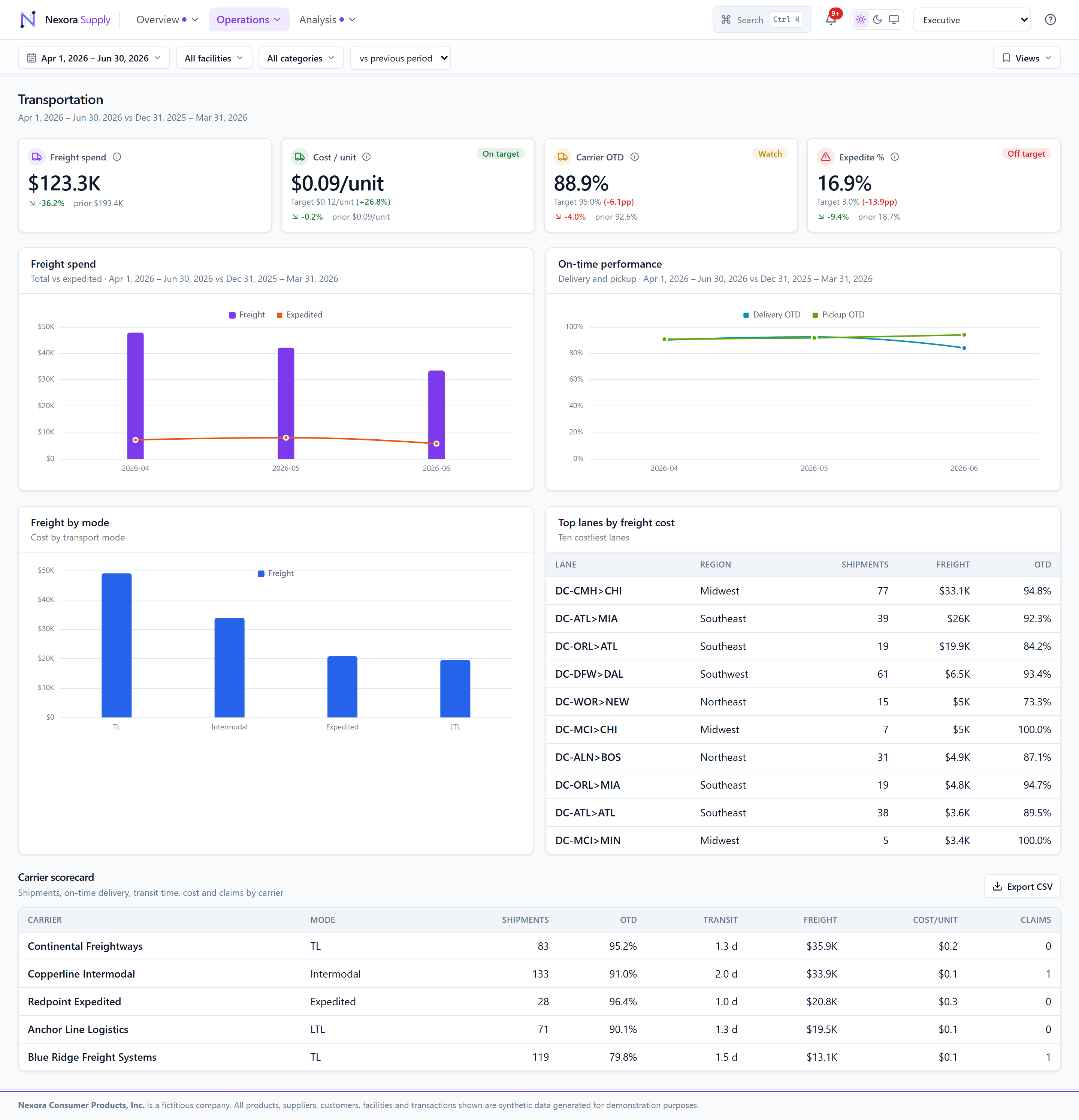 Transportation — carrier & lane performance
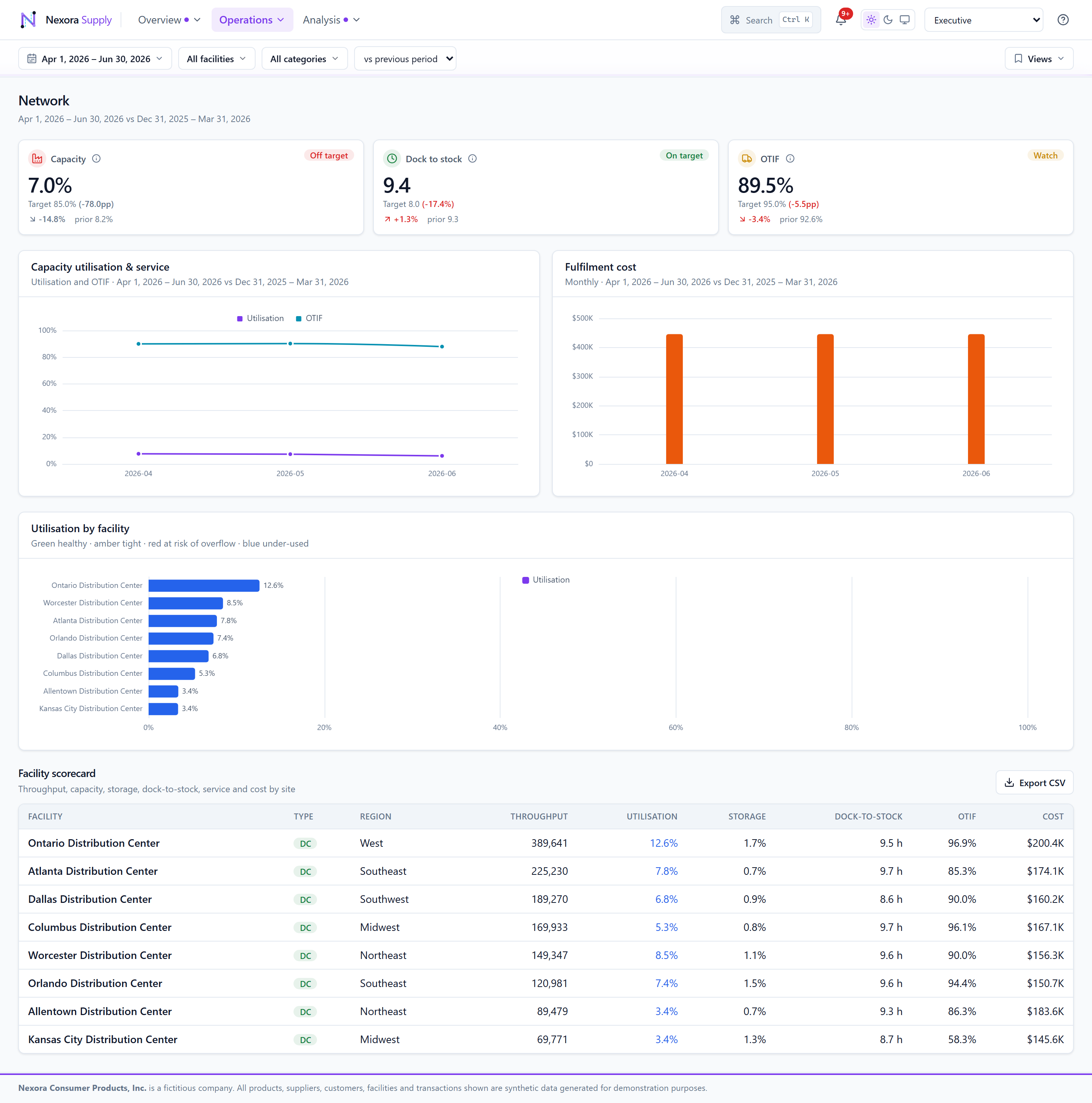 Network — capacity & throughput
Analysis
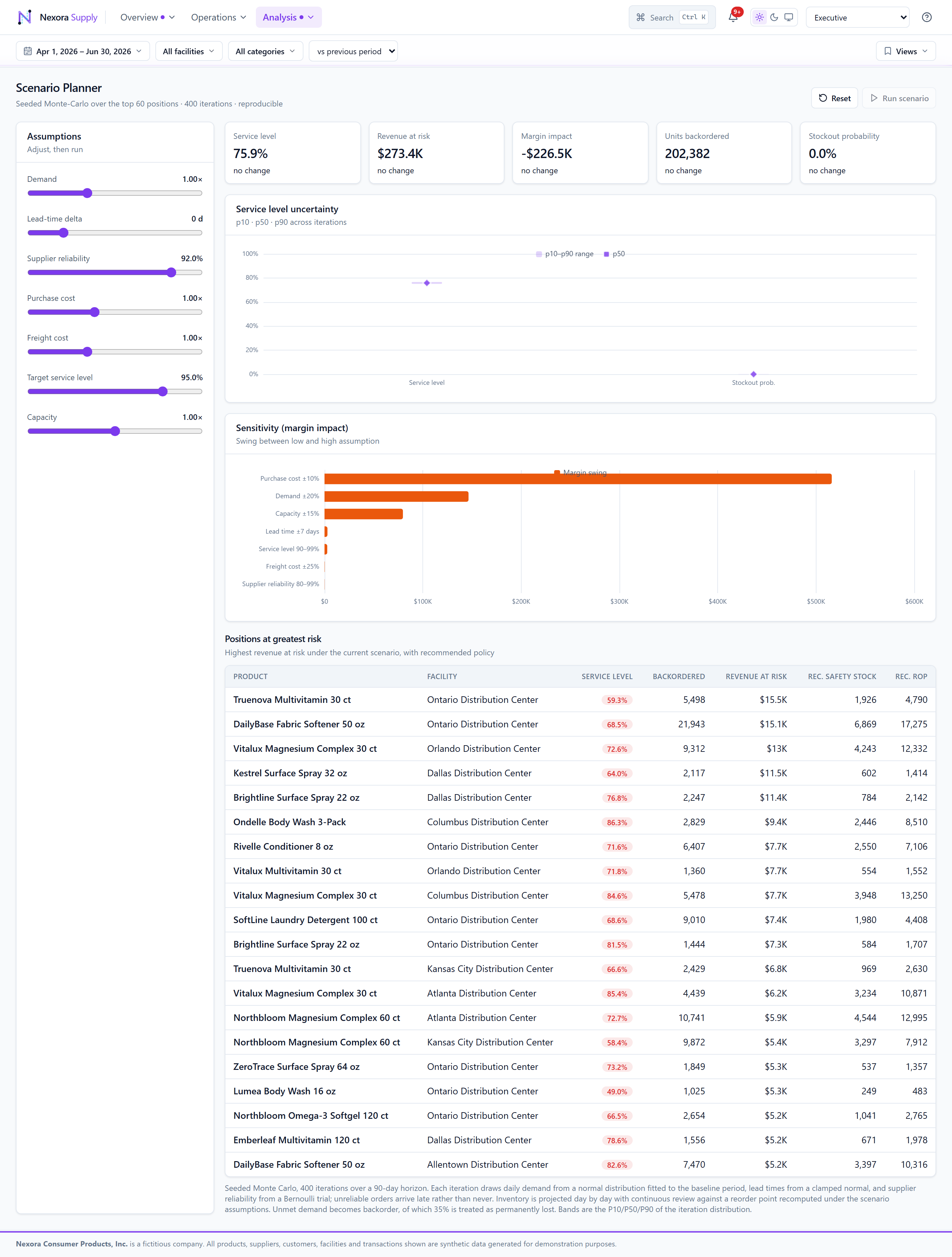
Scenario Planner
What-if simulation with Monte-Carlo uncertainty bands, computed off-thread in a Web Worker so the UI never blocks.
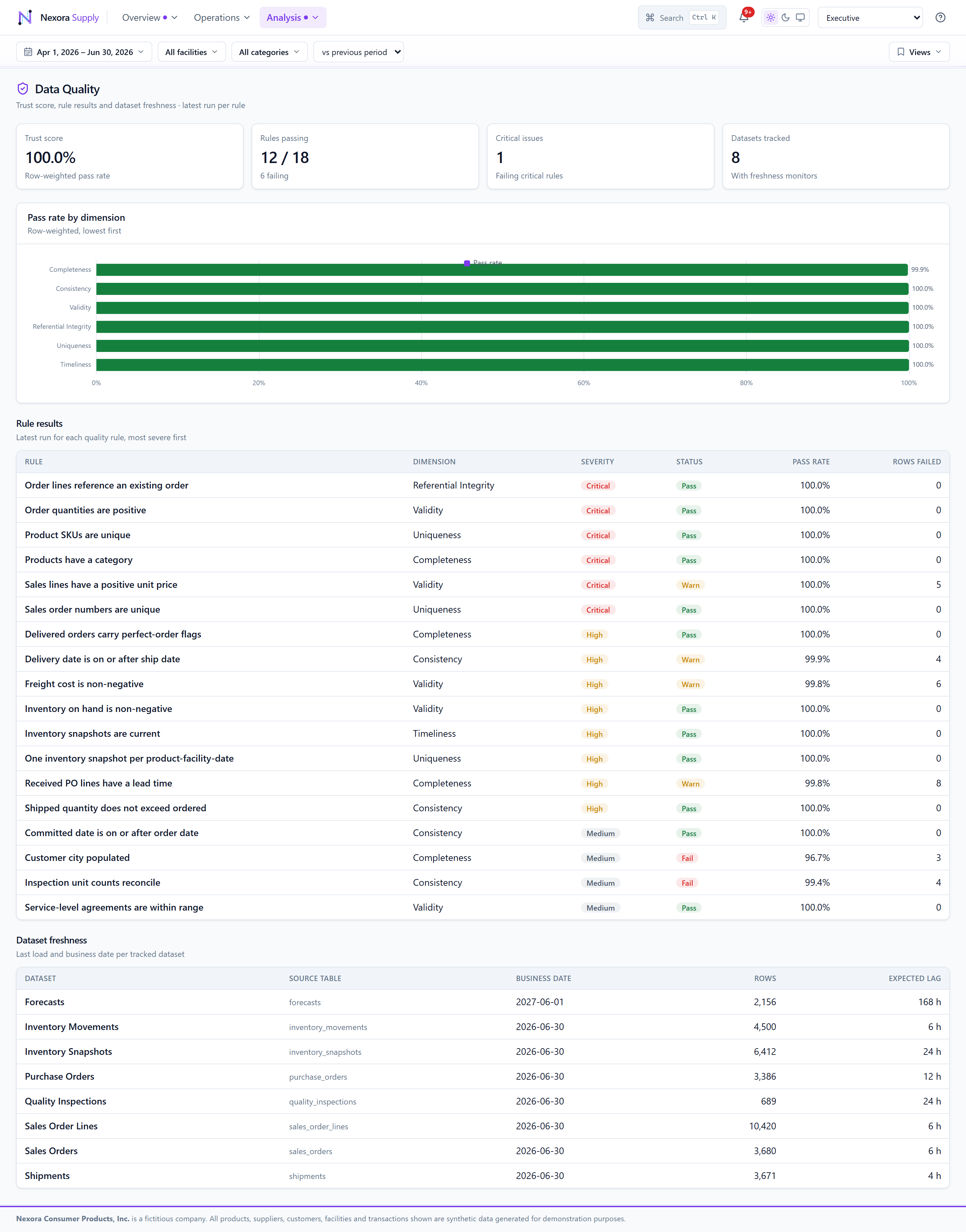
Data Quality
Rule results, a trust score and per-dataset freshness — governance made visible.
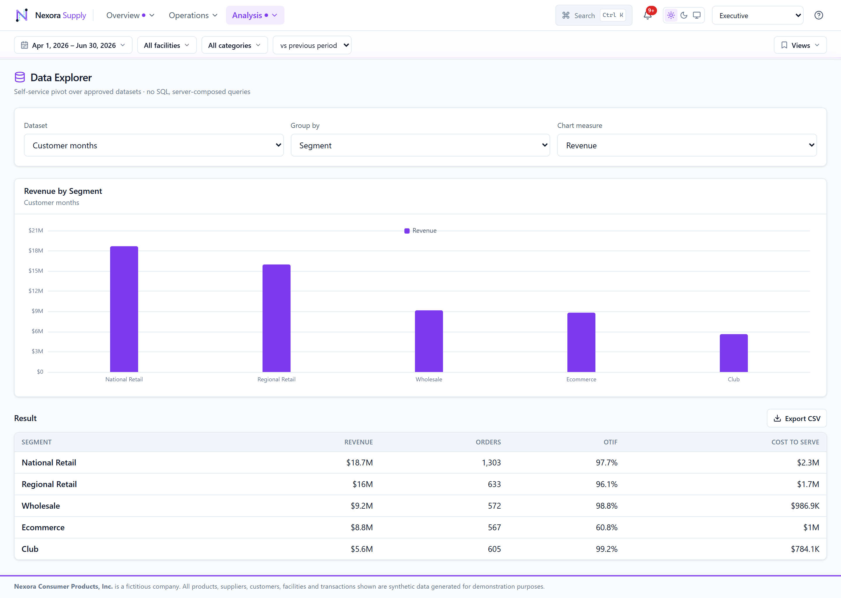
Data Explorer
A self-service pivot & chart builder over approved datasets — governed ad-hoc analysis.
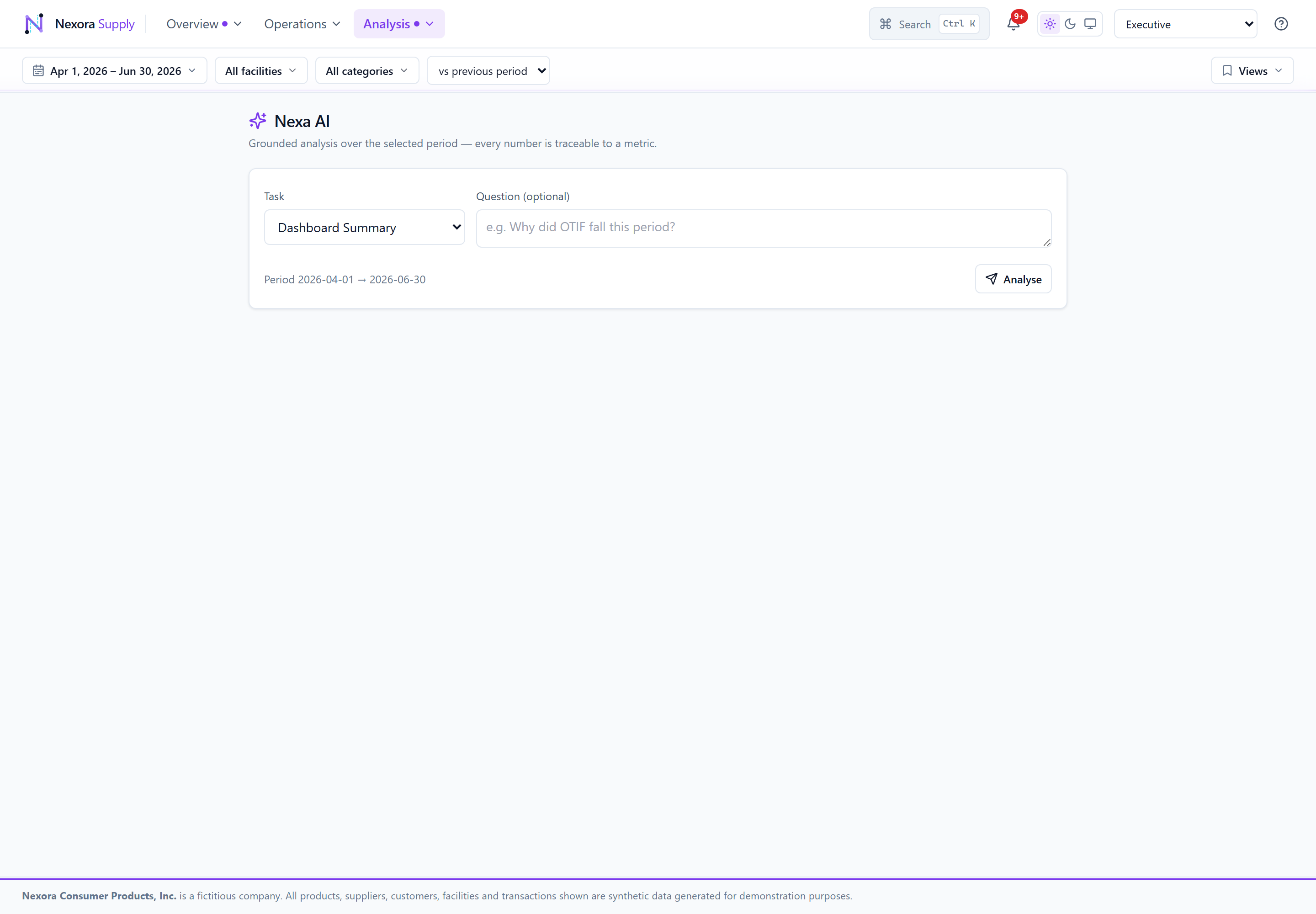
Nexa AI
Grounded AI analysis — every figure is computed from the data and cited as evidence, with recommended actions and a deterministic fallback.
Built to production standards, proven end to end
Nexora is a portfolio build, but it is held to the bar of a shipped product: every route works, the numbers are trustworthy, and it runs on two very different stacks without a line of the UI changing.
Parity, proven — not promised
The Cloudflare and .NET editions return byte-identical analytics. A .NET integration suite hits every endpoint and asserts the shared envelope, so the two runtimes are diffed to the figure — not trusted to agree.
Zero rough edges
All twelve workspaces render with no error states, and an axe accessibility audit came back clean — 0 WCAG 2 A/AA violations. Grouped keyboard-navigable menus, light/dark theming, and null-safe figures that never show a stray “NaN”.
AI you can audit
The Nexa AI copilot narrates only figures computed from the data and cites each as evidence, with a deterministic fallback when the model is unavailable — so it can explain, but never invent.
The same discipline shows up in the details: a virtualised inventory table scrolls thousands of rows without pagination, Monte-Carlo scenario runs happen off the main thread in a Web Worker, and the charting library is code-split so first paint stays lean. The result is a platform that feels solid to use and is honest about its numbers.
Details that make it feel solid
From a 4K board room to a phone
The KPI board reflows from six-up to three-up to two-up; every workspace works on mobile, tablet and desktop, in light or dark.


See it live
Explore all twelve workspaces with synthetic-but-realistic data, switch the demo role, toggle dark mode, and ask the Nexa AI copilot a question.